🐒🐒 Time Series and R Graphics 🐒🐒
This is a resurrection of the Time Series and Graphics page that had been discontinued.
For this page, we’ll use Vanilla R, astsa, and ggplot2. We used to include demonstrations from the ggfortify package, but it was changed so often that eventually most of the examples didn’t work. There are some examples at the end.
Table of Contents
- Part 1 - simple but effective
- Part 2 - two series - sometimes when they touch
- Part 3 - many series
- Part 4 - missing data
- Part 5 - everything else
You’ll need two packages to reproduce the examples. All the data used in the examples are from astsa.
install.packages(c("astsa", "ggplot2"))
💡 You may also want to check out the Cairo package to create high-quality graphics. It’s not necessary, but it sure looks nice.
✨ The Front DooR if you need to find your way home.
Part 1 - simple but effective
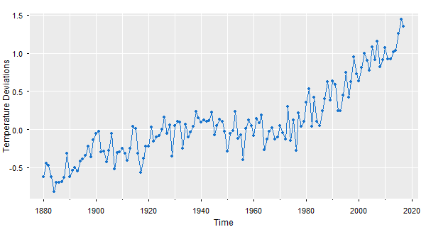
😎 First, here’s how to plot gtemp_land using the base graphics. If you add a grid after you plot, it goes on top. You have some work to do if you want the grid underneath… but at least you can work around that - read on.
# for a basic plot, all you need is
plot(gtemp_land)                    # it can't get simpler than that (not shown)

plot(gtemp_land, type='o', col=4)   # a slightly nicer version
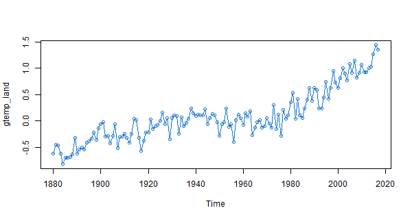
# but here's a pretty version using Vanilla R that includes a grid
par(mar=c(2,2,.5,.5)+.5, mgp=c(1.6,.6,0))                   # trim the margins
plot(gtemp_land, ylab='Temperature Deviations', type='n')    # set up the plot
grid(lty=1, col=gray(.9))                                  # add a grid
lines(gtemp_land, type='o', col=4)                         # and now plot the line
👻 In the above, we used plot, which works for time series. If the data aren’t time series,
you can use plot.ts instead… but either way, plot.ts works for both, so maybe it’s just better to use that for Vanilla R.
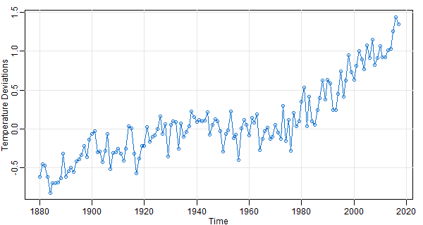
But you can get all that and more with astsa.
# in astsa, it's a one liner
tsplot(gtemp_land, type='o', col=4, ylab='Temperature Deviations')
📣 tsplot was written because we did many demonstrations (mainly in class) and as you can see from the first plot, Vanilla R graphics is ugly without additional fixings. And, we didn’t want to type a hundred lines of code while trying to talk about the data (the students would have revolted by the time we got it all out).
🔵 And a ggplot2 of the gtemp series. ggplot2 doesn’t play with time series so you have to create a data frame that strips the series to its bare naked data.
gtemp.df = data.frame(Time=c(time(gtemp_land)), gtemp=c(gtemp_land)) # strip the ts attributes
ptemp    = ggplot(data = gtemp.df,  aes(x=Time, y=gtemp) )   +   # store it
                  ylab('Temperature Deviations')             +
                  geom_line(col="blue")                      +
                  geom_point(col="blue", pch=1)
ptemp                                                            # plot it

# To remove the gray background, run
ptemp + theme_bw()       # not shown
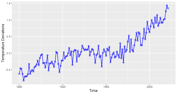
It’s not necessary to store the figure… it’s just an example of what you can do.
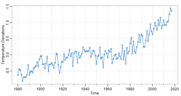
😈 If you like the gray background with white grid lines, you can do a gris-gris plot with astsa (the grammar of astsa is 𝒱𝒪𝒪𝒟𝒪𝒪 💀)
tsplot(gtemp_land, gg=TRUE, type='o', pch=20, col=4, ylab='Temperature Deviations')
Part 2 - two series
👽 Time to get a little more complex by plotting two series that touch each other (but in a nice way) on the same plot. We’ll get to the general stuff soon.
🔵 Here’s an example of ggplot for two time series, one at a time (not the best way for many time series).
gtemp.df    = data.frame(Time=c(time(gtemp_land)), gtemp=c(gtemp_land), gtemp2=c(gtemp_ocean))
ggplot(data = gtemp.df, aes(x=Time, y=value, color=variable )  )             +
              ylab('Temperature Deviations')                                 +
              geom_line(aes(y=gtemp , col='Land Only'),  size=1, alpha=.5)   +
              geom_line(aes(y=gtemp2, col='Ocean Only'), size=1, alpha=.5)   +
              theme(legend.position=c(.1,.85))
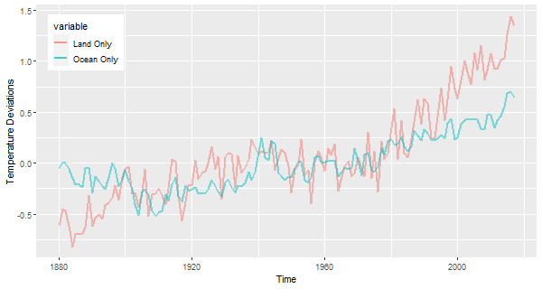
‘Land Only’ and ‘Ocean Only’ have since become my favorite colors.
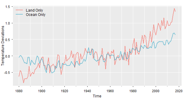
🔵 Now the same idea using tsplot from astsa with the spaghetti option. There are more examples at FUN WITH ASTSA, where the fun never stops.
tsplot(cbind(gtemp_land,gtemp_ocean), col=astsa.col(c(2,5),.5), lwd=2, gg=TRUE,
          ylab='Temperature Deviations', spaghetti=TRUE)
legend("topleft", legend=c("Land Only","Ocean Only"), col=c(2,5), lty=1, bty="n")
💖 Coming in astsa version 2.2 (and beyond), there is an addLegend option in tsplot, por exemplo:
tsplot(cbind(Mortality=cmort, Pollution=part), col=5:6, gg=TRUE, spaghetti=TRUE, addLegend=TRUE)
… that’s it at its most basic - there are more addLegend options (you can always get the updated package from astsa NEWS ).
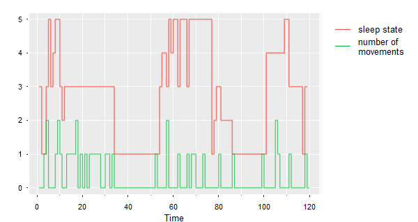
🌐 There may be an occasion when you want the legend on the outer margin. This is one way to do it. The data are sleep states and number of movements.
# depending on the dimension of the plot, you may
#  have to adjust the right margin (9) up or down
#  and/or adjust the inset (-.3)
par(xpd = NA, oma=c(0,0,0,9) )
tsplot(sleep2[[3]][2:3], type='s', col=astsa.col(2:3,.7), spag=TRUE, gg=TRUE)
legend('topright', inset=c(-.3,0), bty='n', lty=1, col=2:3, legend=c('sleep state',
        'number of \nmovements'))
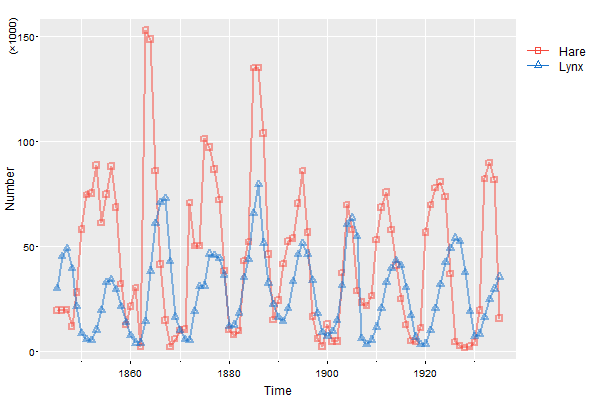
Here’s another way to do it that may be more precise:
par(oma=c(0,0,0,5))
tsplot(cbind(Hare,Lynx), col=astsa.col(c(2,4),.5), lwd=2, type="o", pch=c(0,2), spaghetti=TRUE, ylab='Number', gg=TRUE)
mtext('(\u00D71000)', side=2, adj=1, line=1.5, cex=.8)  # we'll talk about this later
# then put the legend right where you want it
legend(x=1940, y=150, col=c(2,4), lty=1, legend=c("Hare", "Lynx"), pch=c(0,2), bty="n", xpd=NA)
🔵 You’ll see how to do this with ggplot below. In the global temperature example above, just leave off the last line:
gtemp.df    = data.frame(Time=c(time(gtemp_land)), gtemp=c(gtemp_land), gtemp2=c(gtemp_ocean))
ggplot(data = gtemp.df, aes(x=Time, y=value, color=variable )  )             +
              ylab('Temperature Deviations')                                 +
              geom_line(aes(y=gtemp , col='Land Only'),  size=1, alpha=.5)   +
              geom_line(aes(y=gtemp2, col='Ocean Only'), size=1, alpha=.5)
              # theme(legend.position=c(.1,.85))
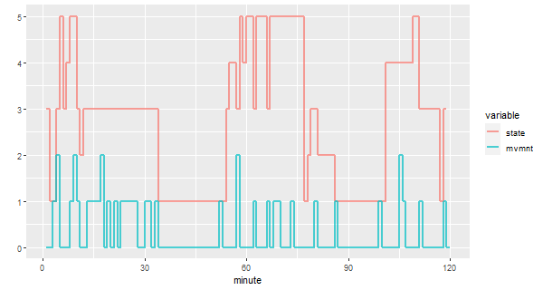
Here’s the ggplot code for the sleep data - the first two lines are used because ggplot wants the data one way only… it’s a recurring theme.
library(reshape)                         # install 'reshape' if you don't have it
df     = melt(sleep2[[3]][,2:3])         # reshape the data frame
minute = rep(1:120, 2)
ggplot(data=df, aes(x=minute, y=value, col=variable)) +
        geom_step(lwd=1, alpha=.7)                    +
        ylab('')                                      +
        scale_x_continuous(breaks = seq(0,120,by=30))
# The last line was used to get more meaningful ticks on the time axis.
Part 3 - many series
🔵 Let’s start with ggplot2. We’re going to plot the 8 explosion series.
library(reshape)            # install 'reshape' if you don't have it
df   = melt(eqexp[,9:16])   # reshape the data frame
Time = rep(1:2048, 8)
ggplot(data=df, aes(x=Time, y=value, col=variable))   +
     geom_line( )                                     +
     theme(legend.position="none")                    +
     facet_wrap(~variable, ncol=2, scales='free_y')   +
     ylab('')
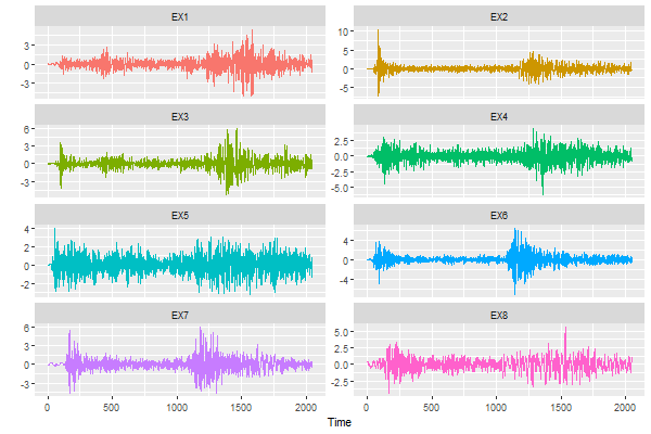
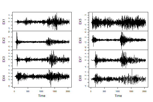
🤓 Now let’s try the same thing with tsplot. We’re going to use the new astsa.col color wheel option and we’ll make it a gris-gris plot. You don’t have to melt anything.
tsplot(eqexp[,9:16], col=astsa.col(4, wheel=TRUE, num=8), ncol=2, gg=TRUE, scale=.8)
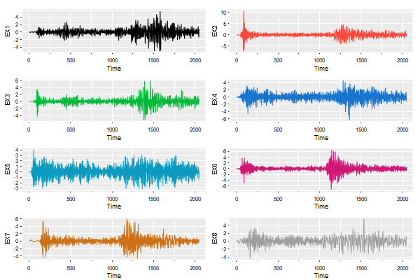
scale controls the size of the axis labels.
🔵 Here it is using basic Vanilla R graphics.
plot.ts(eqexp[,9:16], main='')
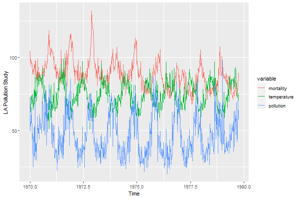
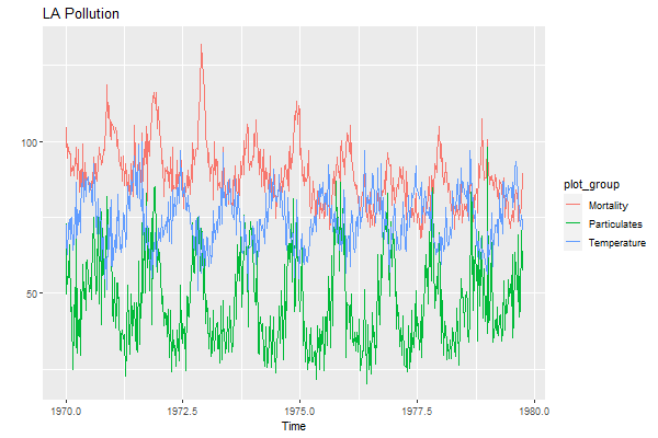
😒 Let’s do another ggplot with more than 2 series on the same plot. The script does not work with time series so you have to spend some time removing the time series attributes. You could try ggfortify, but we’ll hold off until the end for that.
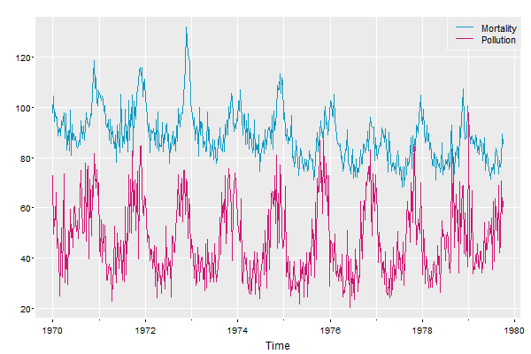
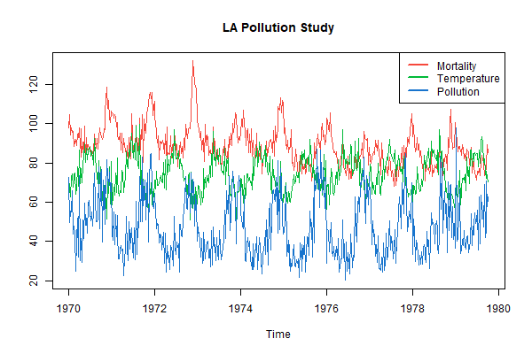
😥 We’re going to use 3 series from the LA Pollution study from astsa. The data are weekly time series, so we’re removing the attributes first.
mortality    = c(cmort)  # cardiovascular mortality
temperature  = c(tempr)  # termperature
pollution    = c(part)   # particulate pollution
df   = melt(data.frame(mortality, temperature, pollution))
Time = c(time(cmort), time(tempr), time(part))
ggplot(data=df, aes(x=Time, y=value, col=variable)) +
    geom_line( )                                    +
    ylab("LA Pollution Study")
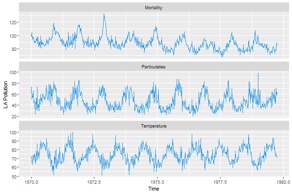
😏 This is how we would do it using tsplot 💖 using the new version 2.3 addLegend option:
tsplot(cbind(cmort,tempr,part), ylab='LA Pollution Study', col=astsa.col(2:4,.8), spag=TRUE, gg=TRUE,
        addLegend=TRUE, legend=c('Mortality', 'Temperature', 'Pollution'), llwd=2)
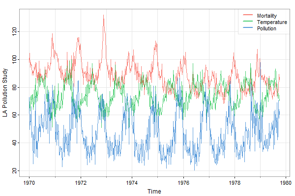
And in Vanilla R graphics:
ts.plot(cbind(cmort,tempr,part), main='LA Pollution Study', col=2:4)
legend('topright', legend=c('Mortality', 'Temperature', 'Pollution'),
          lty=1, lwd=2, col=2:4, bg='white')
Part 4 - missing data
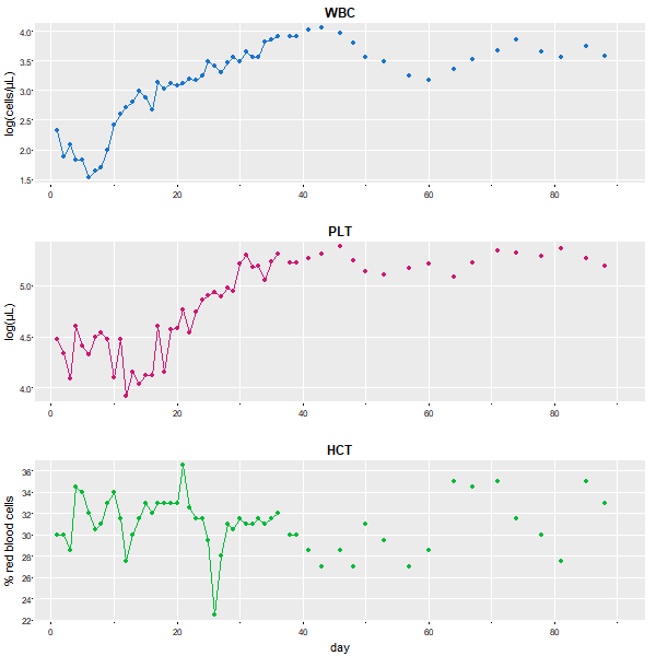
😆 In base graphics, it is sooooooo simple and the result is decent. The data set blood is a multiple time series data set with lots of NAs. You need to have points (type='o' here) to get the stuff that can’t be connected with lines.
# if you leave off the cex=1, the points are too small
plot(blood, type='o', pch=19, main='', cex=1, yax.flip=TRUE)
Again, if blood weren’t a time series, you would use plot.ts instead of plot… BUT you wouldn’t use ts.plot here because that would be a mess - try it and see what happens (not responsible for injuries).
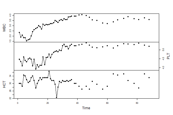
😍 Here it is using astsa:
tsplot(blood, type='o', col=c(4,6,3), pch=19, cex=1, gg=TRUE)
🎉 🎈 Nothing to it! 🎈 🎉
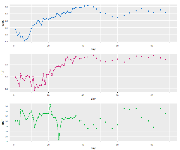
 So, here it is with
 ggplot2. It works ok, but you get warnings and other frustrations you’ll see along the way…
# make a data frame removing the time series attributes
df = data.frame(day=c(time(blood)), blood=c(blood), Type=factor(rep(c('WBC','PLT','HTC'), each=91)) )

# notice that the factor levels of Type are in alphabetical order...
levels(df$Type)
   [1] "HTC" "PLT" "WBC"

# ... if I don't use the next line, the plot will be in alphabetical order ...
# ... if I wanted the series in alphabetical order ...
# ... I would have ordered it that way - so I need ...
# ... the next line to reorder them back to the way I entered the data   ...
df$Type = factor(df$Type, levels(df$Type)[3:1])

# any resemblance to the blood work of actual persons, living or dead, is purely coincidental
ggplot(data=df, aes(x=day, y=blood, col=Type))       +
       ylab("Mary  Jane's  Blood  Work")             +
       geom_line()                                   +
       geom_point()                                  +
       theme(legend.position="none")                 +
       facet_wrap(~Type, ncol=1, scales='free_y')

# Danger, Will Robinson! Warning! Warning! NAs appearing!
 Warning messages:
 1: Removed 9 rows containing missing values (geom_path).
 2: Removed 111 rows containing missing values (geom_point).
# We're doomed! Crepes suzette!
🔆🔆🔆🔆🔆
We’re not done. At least we got the plot after some work and warnings. But notice that the vertical axes have to have a common name. If you want individual labels (e.g., WBC is measured in cells/μL) then you’re in a load of 💩💩💩 … we guess that’s not in the grammar of graphics too.). Anyway, we found this a long time ago if you want to force the matter: how to plot differently scaled multiple time series with ggplot2… like this is rare???? 🙄🙄🙄
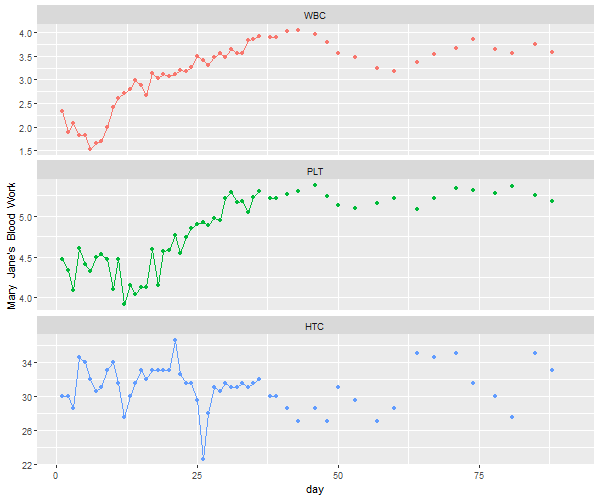
Ok - let’s redo it with tsplot with different y-labels and, if you dare, try this with 👶 ggplot too 👶 (if you use the link above, we won’t consider it as cheating).
# need astsa version 2.4 or higher to get 'title' and 'xlab' correct
tsplot(blood, type='o', col=c(4,6,3), pch=19, scale=.95, gg=TRUE,
       title = colnames(blood),  xlab  = c(NA, NA,'day'), las=1,
       ylab  = c( 'log(cells/\u03BCL)', 'log(\u03BCL)', '% red blood cells' ))
Part 5 - everything else
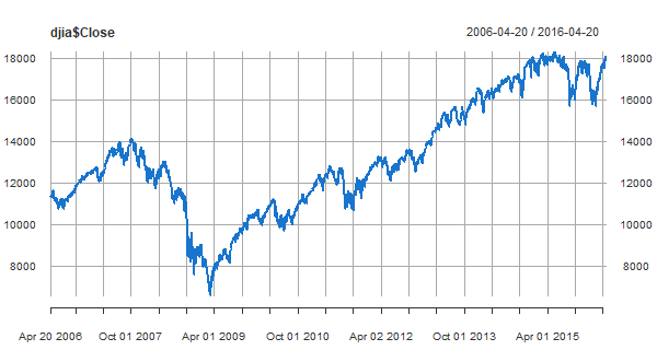
xts and zoo
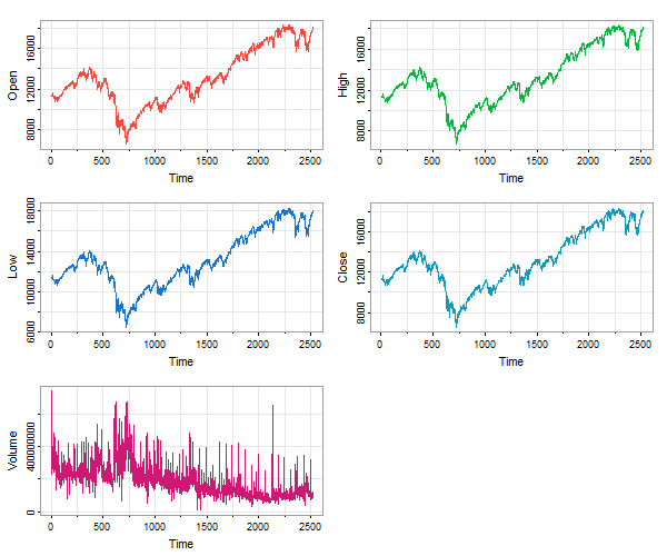
🐯 First, some important packages for time series in R are xts and zoo. Installing xts is enough to get both.
install.packages('xts')  # if you don't have it already
library(xts)             # load it
#
plot(djia$Close, col=4)  # 'djia' is an 'xts' data file in 'astsa'
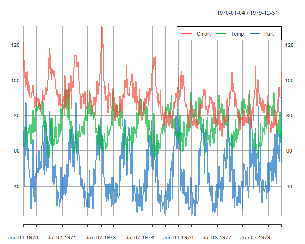
pollution, weather, and mortality
Now we’ll take the daily data from the LA Pollution Study: lap.xts (in astsa), take weekly averages and then plot those.
library(xts)

# get weekly averages from daily data
lapw = apply.weekly(lap.xts, FUN=colMeans)

plot(lapw[,c('Cmort', 'Temp', 'Part')], col=astsa.col(2:4, .7), main=NA)
addLegend(col=2:4, lty=1, lwd=2, ncol=3, bty="white")
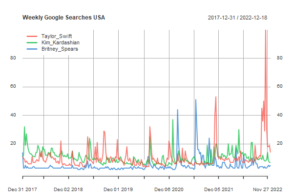
you go girl
It’s fun to compare google searches… here’s one for some female celebs taken from Google trends, weekly number of searches for 5 years. The downloaded data come in a .csv file with dates in the first column and looks something like this:
Week,Taylor_Swift,Kim_Kardashian,Britney_Spears
12/31/2017,11,11,14
1/7/2018,10,12,3
1/14/2018,9,32,3
1/21/2018,7,19,5
...
This is where xts and zoo can make your life easier.
library(xts)  # loads both xts and zoo
x = read.zoo("google.csv", header=TRUE, sep=',', format = "%m/%d/%Y")
plot(as.xts(x), col=astsa.col(2:4,.7), main='Weekly Google Searches USA')
addLegend("topleft", col=2:4, lty=1, lwd=2, bg=gray(1), bty='o', box.col=gray(1))
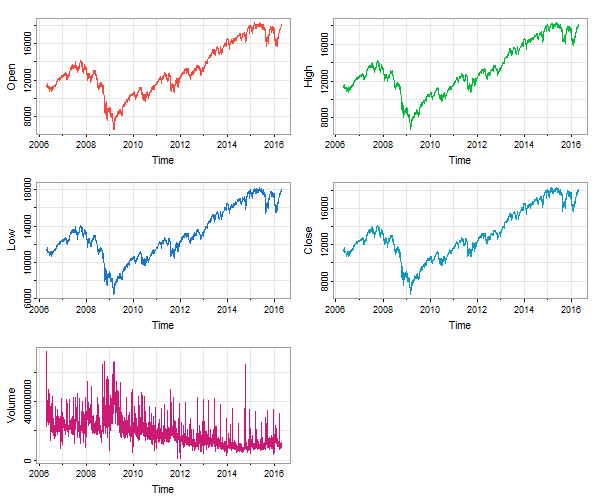
🐯 In case xts is not available, you can use timex from astsa to plot xts data files. For example, djia is an xts data file. But if you plot the data without xts being loaded, you lose the dates on the time axis:
tsplot(djia, ncol=2, col=2:6) # no dates
Instead, you can do this:
tsplot(timex(djia), djia, ncol=2, col=2:6) # dates
ggfortify
🔵 We should probably give ggfortify a little space, BUT there are NO guarantees that what you see here will work in the future. These data are from lap , which is different from lap.xts. The help file ?lap.xts has the info.
install.packages('ggfortify')  # if you don't have it already
library(ggfortify)             # load it

# all on same plot
autoplot(cbind(Mortality=cmort, Temperature=tempr, Particulates=part),
           xlab='Time', facets=FALSE, main='LA Pollution')

# different plots
autoplot(cbind(Mortality=cmort, Temperature=tempr, Particulates=part),
            xlab='Time', ylab='LA Pollution', ts.colour = 4)
AGAIN, note that the order of the series is alphabetical and NOT in the input order.
To do the google search example above with ggplot try this (not shown)
library(ggfortify)
autoplot(as.xts(x), facets=FALSE)
but it’s in alphabetical order, so Taylor is last when she should be first!
ribbon plot
🦆 But here’s something in the grammar of graphics too (ggplot2) … a pretty ribbon plot of the Southern Oscillation Index:
cblue = astsa.col(5, .5)  # a little pastel
cred  = astsa.col(6, .5)  # is always refreshing
#
df    = data.frame(Time=c(time(soi)), SOI=c(soi), d=ifelse(c(soi)<0,0,1))
#
ggplot( data=df, aes(x=Time, y=SOI) )                              +
 geom_ribbon(aes(ymax=d*SOI, ymin=0,  fill = "cool"))              +
 geom_ribbon(aes(ymax=0,  ymin=(1-d)*SOI, fill = "warm"))          +
 scale_fill_manual(name='SST', values=c("cool"=cblue,"warm"=cred)) +
 theme(legend.position=c(.05,.12))
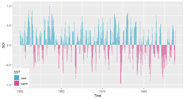
Well that might be pretty, but it obscures the trend, don’t you think?
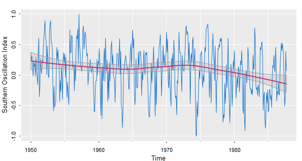
trend
🐸 If you really want to capture trend, try trend from astsa.
We’re using various options here, a lowess fit and a gris-gris plot.
trend(soi, lowess=TRUE, ylab="Southern Oscillation Index", gg=TRUE)
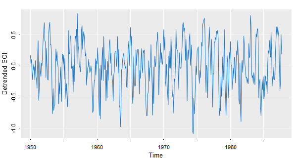
📈 To see the detrended series, use detrend from astsa
tsplot(detrend(soi, lowess=TRUE), col=4, ylab="Detrended SOI", gg=TRUE)
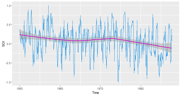
🍿 And now with ggplot (remember to strip the attributes):
df = data.frame(Time=c(time(soi)), SOI=c(soi))
ggplot( data=df, aes(x=Time, y=SOI) )        +
        geom_line(col=4)                     +
        geom_smooth(col=6)
steps
🦀 Here’s a discrete-valued series plotted as a step function. EQcount in astsa is a count of certain types of earthquakes.
tsplot(EQcount, col=4, type='s')
points(EQcount, pch=21, col=4, bg=6)   # just for kicks, not needed and better without it
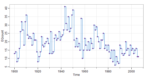
A type='h' instead of type='s' looks good too.
size matters
🌵 If you did not know this already , with time series, the dimensions of the plot matters.
🚸 By default, R graphic devices are square (7 by 7 inches), which is generally bad for plotting time series as you will see. And, it’s actually bad practice in general. Edward Tufte, the expert on data visualization recommended using a golden rectangle in landscape orientation for most graphics. The golden rectangle is a rectangle with a side ratio of approximately 1:1.618. If a graph suggests a shape on its own, follow that shape. If the graph doesn’t suggest a shape, use a rectangular shape with one side 50% longer than the other.
Apparently, you learn this in the 6th or 7th grade. If you didn’t, check this out.
In general, square graphs are for squares. I use an .Rprofile file in the working directory that takes care of this so I don’t have to fix this with every plot:
# graphic windows are 9 by 6 inches by default (it's not quite golden, but I like it)
grDevices::windows.options(width = 9, height = 6)

# allows a quick use of Cairo - just cw() before a plot
# get Cairo:  install.packages('Cairo')
cw = function(w=9, h=6){Cairo::CairoWin(width = w, height = h)}
This consideration DOES NOT apply if you use RStudio. If you do use RStudio, you are 💩💩💩 out of luck because it’s hip to be square in the studio.
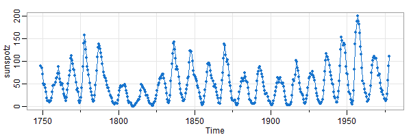
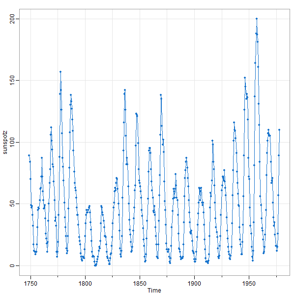
🤔 Here’s the sunspot series from astsa using 2 different window sizes. In the first plot, you see that the series rises quickly ↑ and falls slowly ↘ . The second (square) plot obscures this fact.
tsplot(sunspotz, type='o', pch=20, col=4)
size really does matter
This is for base R… ggplot has similar problems but we’ll let others take care of that. When you do multifigure plots, the character expansion (cex) factor can get very small. For example
> par('cex')
  [1] 1
> par(mfrow=2:1)
> par('cex')
  [1] 1
> par(mfrow=c(3,1))
> par('cex')
  [1] 0.66   <-- this is ok on a screen, but too small for publication
Here’s an example
par(mfrow=c(3,1))
acf1(soi, 48, col=4, main="Southern Oscillation Index")
acf1(rec, 48, col=4, main="Recruitment")
ccf2(soi, rec, 48, col=4, main="SOI vs Recruitment")
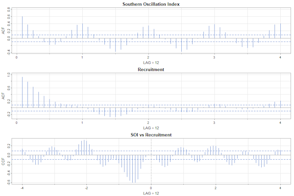
par(mfrow=c(3,1), cex=.9)
acf1(soi, 48, col=4, main="Southern Oscillation Index")
acf1(rec, 48, col=4, main="Recruitment")
ccf2(soi, rec, 48, col=4, main="SOI vs Recruitment")
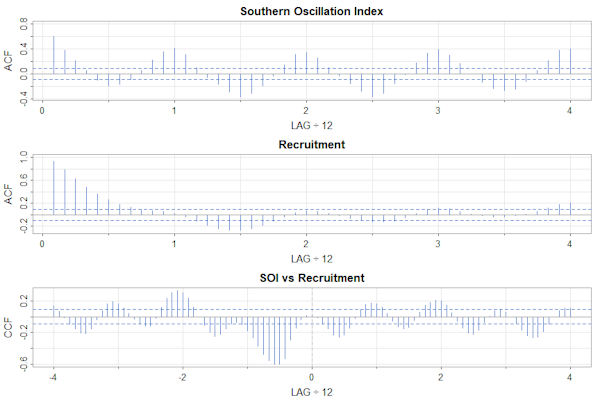
The interiors of the plots are similar, but the text in the first one is too small.
In astsa version 2.2, we added a scale component to tsplot to help with the problem… compare these if you have version 2.2 or higher:
tsplot(cbind(big=rnorm(100),bad=rnorm(100), john=rnorm(100)), scale=.75)  # match base R
tsplot(cbind(big=rnorm(100),bad=rnorm(100), john=rnorm(100)))             # default scale 1
tsplot(cbind(big=rnorm(100),bad=rnorm(100), john=rnorm(100)), scale=1.5)  # and way too big
The scale factor doesn’t work for one-at-a-time plotting, so use the first method; e.g., this works with any version of astsa:
par(mfrow=c(3,1))          # too small
tsplot(cmort); tsplot(tempr); tsplot(part)

par(mfrow=c(3,1), cex=.9)  # so fix it
tsplot(cmort); tsplot(tempr); tsplot(part)
large values on the axis
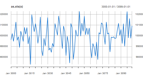
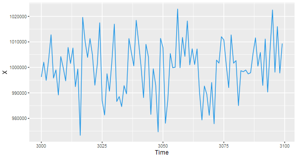
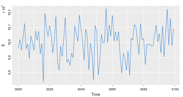
⚽ Dealing with large values on the vertical axis can be a bit of a pain because R graphics and consequently other packages (that I know of) don’t do anything about it. Let’s generate data that take on large values:
x = ts(rnorm(100, 1000000, 10000), start=3000)
Now we’ll try various plots-
# xts
library(xts)
plot(as.xts(x), col=4)
# ggplot
df = data.frame(Time=c(time(x)), X=c(x))
ggplot(data=df, aes(x=Time, y=X) ) + geom_line(col=4)
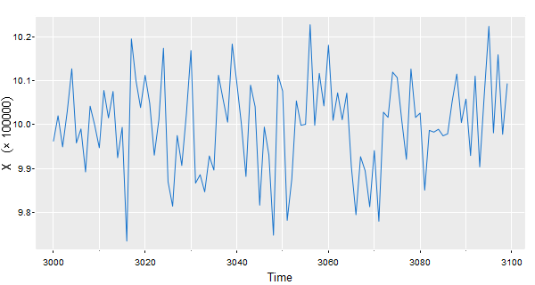
🐵 Our suggestion is to do something like the following…
# tsplot with a trick - in the expression ""%*% is a cross and ~ is a space
tsplot(x/10^5, col=4, gg=TRUE, ylab=expression(X~~~~(""%*% 100000)))

# this unicode character also works
tsplot(x/10^5, col=4, gg=TRUE, ylab=(X~~~~('\u00D7 100000')))
If you want to move the (x 100000) to the edge, you can do something like this
tsplot(x/10^5, col=4, gg=TRUE, ylab='X', las=0)
mtext(expression('\u00D7'~10^5), side=2, adj=1, line=1.5, cex=.9)
That kind of trick works with ggplot and xts, for example (not shown)
# ggplot
df = data.frame(Time=c(time(x)), X=c(x))
ggplot(data=df, aes(x=Time, y=X/100000) ) + geom_line(col=4) +
 ylab(X~~~~('\u00D7 100000'))

# xts
plot(as.xts(x/100000), col=4, main='', ylab=expression(X~~~('\u00D7 100000') ))
I like this site for a list of unicode characters because it is well laid out and lists the various versions of the characters. For R, use the escape version.
bring back the 60s
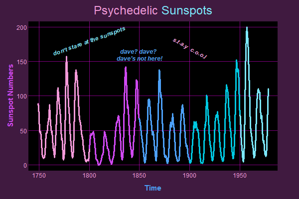
🍄 And finally, a psychedelic base graphics plot of the sunspot numbers: 🍄
x      = sunspotz
culer1 = rgb(242, 153, 216, max=255)
culer2 = rgb(208,  73, 242, max=255)
culer3 = rgb( 77, 161, 249, max=255)
culer4 = rgb(  0, 200, 225, max=255)
culer5 = rgb(124, 231, 251, max=255)

par(mar=c(2,2,1,1)+2, mgp=c(3,.2,0), las=1, cex.main=2, tcl=0, col.axis=culer1, bg=rgb(.25,.1,.25))
plot(x, type='n', main='', ylab='', xlab='')
rect(par("usr")[1], par("usr")[3], par("usr")[2], par("usr")[4], col='black')
grid(lty=1, col=rgb(1,0,1, alpha=.5))
lines(x,                     lwd=3, col=culer1)
lines(window(x, start=1800), lwd=3, col=culer2)
lines(window(x, start=1850), lwd=3, col=culer3)
lines(window(x, start=1900), lwd=3, col=culer4)
lines(window(x, start=1950), lwd=3, col=culer5)
title(expression('Psychedelic' * phantom(' Sunspots')), col.main=culer1)
title(expression(phantom('Psychedelic') * ' Sunspots'), col.main=culer5)
mtext('Time', side=1, line=2, col=culer3, font=2, cex=1.25)
mtext('Sunspot Numbers', side=2, line=2, col=culer2, font=2, las=0, cex=1.25)
text(1800, 180, "don't stare at the sunspots", col=culer5, srt=20, font=4)
text(1900, 170, "s.t.a.y  c.o.o.l", col=culer1, srt=330, font=4)
text(1850, 160, "dave? dave? \n dave's not here!", col=culer3, font=4)
🐒 𝔼 ℕ 𝔻 🐒